-
@key frame 보더 회전 애니메이션Web/인프런 2022. 1. 13. 17:47
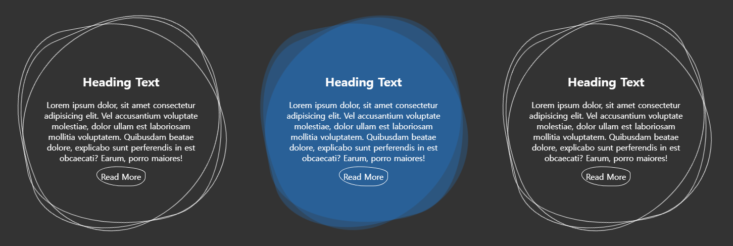
<애니메이션 미리보기>
See the Pen radius rotate by seohyeon baek (@100seo) on CodePen.
<코드블럭>
기본 html 구문 불러오기
<!DOCTYPE html>
<html lang="ko">
<head>
    <meta charset="UTF-8">
    <meta http-equiv="X-UA-Compatible" content="IE=edge">
    <meta name="viewport" content="width=device-width, initial-scale=1.0">
    <title>keyframe</title>
    <link rel="stylesheet" href="css/style.css">
</head>
<body>

    <div class="container">
        <div class="square">
            <span></span>
            <span></span>
            <span></span>
            <div>
                <h2>Heading Text</h2>
                <p>
                    Lorem ipsum dolor, sit amet consectetur adipisicing elit. Vel accusantium voluptate molestiae, dolor ullam est laboriosam mollitia voluptatem. Quibusdam beatae dolore, explicabo sunt perferendis in est obcaecati? Earum, porro maiores!
                </p>
                <a href="#">Read More</a>
            </div>
        </div>
    </div>
</body>
</html>
css 작업
body{ background-color: #333; display: flex; justify-content: center; /*수평중앙*/ align-items: center; /*수직중앙*/ height: 100vh; } a{ text-decoration: none; } .container{ display: flex; } .square{ width: 400px; height: 400px; position: relative; margin: 40px; } .square span{ width: 100%; /*inherit로해도 무방*/ height: 100%; position: absolute; border: 1px solid #fff; border-radius: 40% 60% 30% 55% / 40% 35% 45% 60%;/*슬래시로 중첩해서 사용*/ transition: 0.5s; /*hover했을때 bgc나타나는 시간*/ } /*각각을 hover했을때 선은 없어지고 컬러만 나타냄*/ .square:nth-child(1):hover span{ background-color: crimson; border: none; } .square:nth-child(2):hover span{ background-color: dodgerblue; border: none; } .square:nth-child(3):hover span{ background-color: yellowgreen; border: none; } /*애니메이션 시차 두어 교차하도록 함*/ .square span:nth-child(1){ animation: circle 6s linear infinite; } .square span:nth-child(2){ animation: circle 4s linear infinite; animation-direction: reverse; /*시계반대방향*/ } .square span:nth-child(3){ animation: circle 10s linear infinite; } /*hover했을때 bgc투명도 조절. 따로하는 이유는 기존 border 투명도 유지 위해*/ .square:hover span:nth-child(1){ opacity: 0.3; } .square:hover span:nth-child(2){ opacity: 0.6; } .square:hover span:nth-child(3){ opacity: 0.8; } .square div{ /* border: 1px solid red; */ position: absolute; top: 50%; left: 50%; transform: translate(-50%, -50%); width: 80%; text-align: center; color: #fff; } .square div a{ color: #fff; border: 1px solid #fff; padding: 8px; border-radius: 40% 60% 30% 55% / 40% 35% 45% 60%; } @keyframes circle{ 0%{ transform: rotate(0); } 100%{ transform: rotate(360deg);/*360도 시계방향회전*/ } }'Web > 인프런' 카테고리의 다른 글
아코디언 갤러리 html, css 코드 소스 (0) 2022.01.20 @keyframe 도형 로딩 애니메이션 (0) 2022.01.07